


SUMMARY
In the task of designing a flashcard app using Adobe XD, the focus extended beyond mere functionality to encompass the creation of a cohesive design system. This endeavor emphasized the pivotal role of research, brainstorming, and sketching, guided by the fundamental tenets of Interface Design encapsulated in the "3 C's": COLOR, CONTENT, and CONTRAST. The implementation of these principles was facilitated through the development of a comprehensive Design System. Moreover, considerations for User Experience were paramount, necessitating ongoing communication with professors and peers to ensure alignment with user needs and preferences. Throughout the project, an emphasis on effective time management and continual learning underscored the importance of a methodical approach to achieving project objectives.
goals
Throughout the duration of this project, my primary objectives revolved around acquiring new tools, insights, and principles to enrich my arsenal of design skills for future endeavors. Notably, the focus was placed on refining research development practices, thereby enhancing my proficiency in integrating research findings into the design process. This involved meticulous examination of existing flashcards to discern patterns of success and pitfalls to avoid, thereby fostering a nuanced understanding of design uniqueness. Additionally, the project served as a platform for deepening my comprehension of UI/UX design principles, particularly through the extensive utilization of Adobe XD in crafting the flashcards. Despite encountering challenges, particularly in navigating typography nuances for digital mediums, the project provided valuable insights into the application of design rules and principles. Arguably, the most significant takeaway from this endeavor was the mastery of Adobe XD, which not only expanded my knowledge but also honed my practical skills with the software.
LOW-FI WIREFRAME
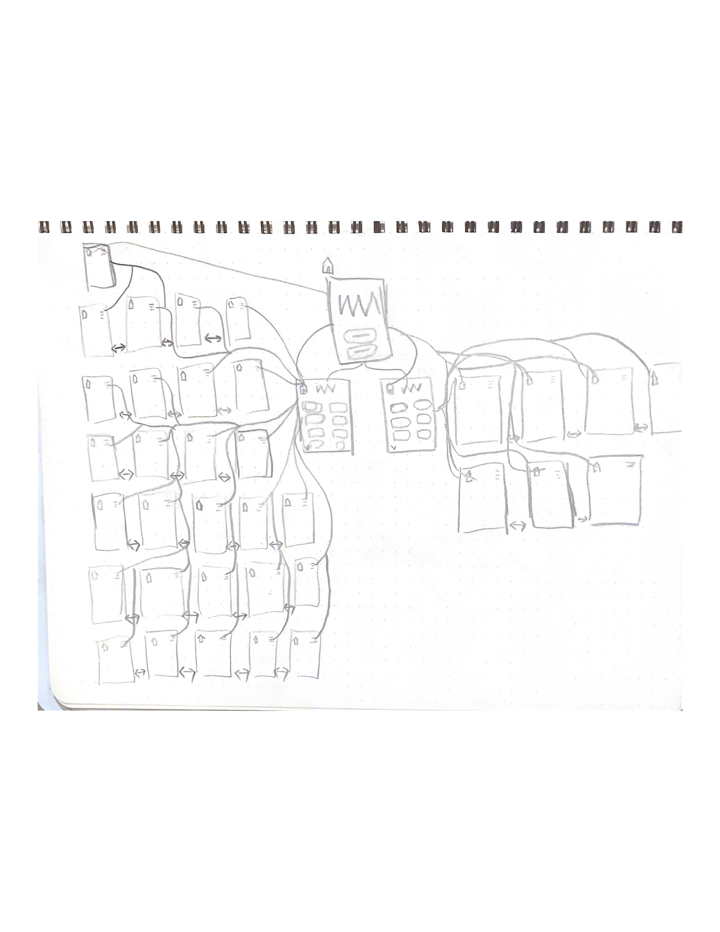
Initially, my lo-fi wireframes lacked complexity, focusing on a simple flipping effect. I prioritized clear functionality and design balance, ensuring readability and usability while maintaining a cohesive design. The goal was to enhance the user experience without distracting from the flashcards.
design sketches

medium wireframe
Building upon the foundational framework established in the low-fidelity wireframes, the medium-fidelity wireframes sought to refine and iterate upon design elements to achieve a more polished final product. Central to this phase was the establishment of a cohesive design language, characterized by consistent visual elements and interaction patterns. Notably, careful attention was paid to color and style choices, with a focus on hierarchy and contrast to optimize readability and usability. By presenting terms and definitions on white flashcards against a complementary background, potential distractions were minimized, ensuring that the core content remained the focal point. Through strategic placement and layout, the wireframes aimed to guide user attention towards key elements, thereby enhancing overall comprehension and usability.
Final DESign
The culmination of the design process yielded a final product characterized by a harmonious blend of functionality and aesthetics. Informed by insights gleaned from earlier design iterations and user feedback, the final design sought to encapsulate the essence of the project objectives while addressing user needs and preferences. Notably, the decision to standardize the use of Helvetica font throughout the design system was driven by considerations of readability and visual consistency. Furthermore, the categorization of terms into HTML and CSS facilitated intuitive navigation, allowing users to seamlessly access relevant content. The incorporation of interactive elements, such as tapping on flashcards to reveal definitions, added an additional layer of engagement, enhancing the overall user experience.
design system

flash card back and front with cohesive design

home page and term list page with cohesive design


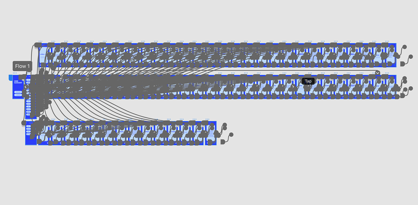
NAVIGATION MAP
The navigation map served as a crucial blueprint for guiding users through the app's interface, ensuring intuitive interaction and seamless navigation. At its core, the navigation map sought to simplify the user journey, providing clear pathways for accessing key features and content. Notably, the inclusion of intuitive icons, such as a slide drawer navigation for returning to the homepage, and clear component delineations facilitated ease of use and navigation. Additionally, the incorporation of interactive elements, such as tapping on flashcards to reveal definitions, further enhanced user engagement and interaction. By prioritizing clarity and simplicity, the navigation map aimed to streamline the user experience, ultimately fostering a more enjoyable and efficient interaction with the app.
navigation map
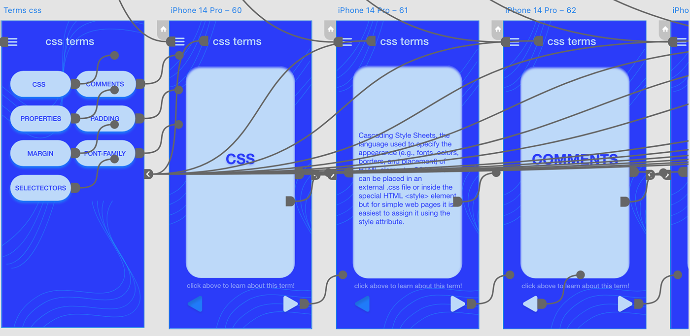
APP PROTOTYPE BUILD
In the iterative process of app prototype development, a meticulous approach was adopted to ensure the seamless integration of design elements and functionalities. Central to this phase was the extensive utilization of components, which served as the building blocks for the app's interface. By standardizing design elements and interaction patterns, the use of components enhanced both usability and consistency across different pages and sections of the app. Notably, clear instructions were incorporated below flashcards to provide guidance and enhance user understanding. Additionally, the inclusion of intuitive navigation elements, such as "next" and "back" buttons, facilitated ease of use and navigation, ensuring a frictionless user experience. Through iterative refinement and testing, the app prototype evolved into a cohesive and intuitive platform, poised to deliver an engaging and user-centric experience.
prototype
prototype between front and back cards
knowledge gained
This project provided valuable lessons in UI/UX design, design principles, and XD utilization. Experimentation with user interaction enhanced my understanding of app usability. Adapting design principles within the app's constraints was a learning curve, particularly in mastering XD's tools, abilities, and limitations. Overall, the project bolstered my proficiency in XD and deepened my understanding of design principle
demo video
interactive version - click to try it yourself


